
Sales & Specification Support: 800-428-5367 A Division of American Lighting Brands 941 Cernan Drive, Bellwood, IL 60104  ·  Handcrafted since 1905
0%

Choosing the right Picture and art lighting is not simply a matter of making artwork brighter. Light changes everything. It affects color, texture, mood, and even how long a painting remains stable.

A good lighting plan begins with the artwork, not the fixture. Oil paintings may benefit from controlled, warm illumination that reveals brushwork without creating harsh glare. Prints, photographs, and watercolors often need gentler exposure, especially when their pigments are sensitive to ultraviolet and excessive heat. Experienced designers usually examine the frame, wall color, viewing distance, and available daylight before recommending a solution. Measure twice.

Color temperature matters, but it is not the whole answer. A lamp around 2700K can create a warm, gallery-like atmosphere, while 3000K may show neutral colors more clearly. High color rendering, low glare, and adjustable beam angles are equally important. The light should fall evenly across the artwork, avoiding bright patches near the center or distracting reflections on glass.

There is no universal formula. A fixture that looks excellent in a showroom may feel too intense in a small hallway. I have found that small adjustments often produce the strongest improvement: shifting the angle, lowering brightness, or adding a dimmer. Still, even careful planning can miss something. Frame depth, changing daylight, and personal taste may alter the final result. This guide explores practical choices, common mistakes, and reliable methods for creating Picture and art lighting that protects the artwork while making it genuinely enjoyable to view.
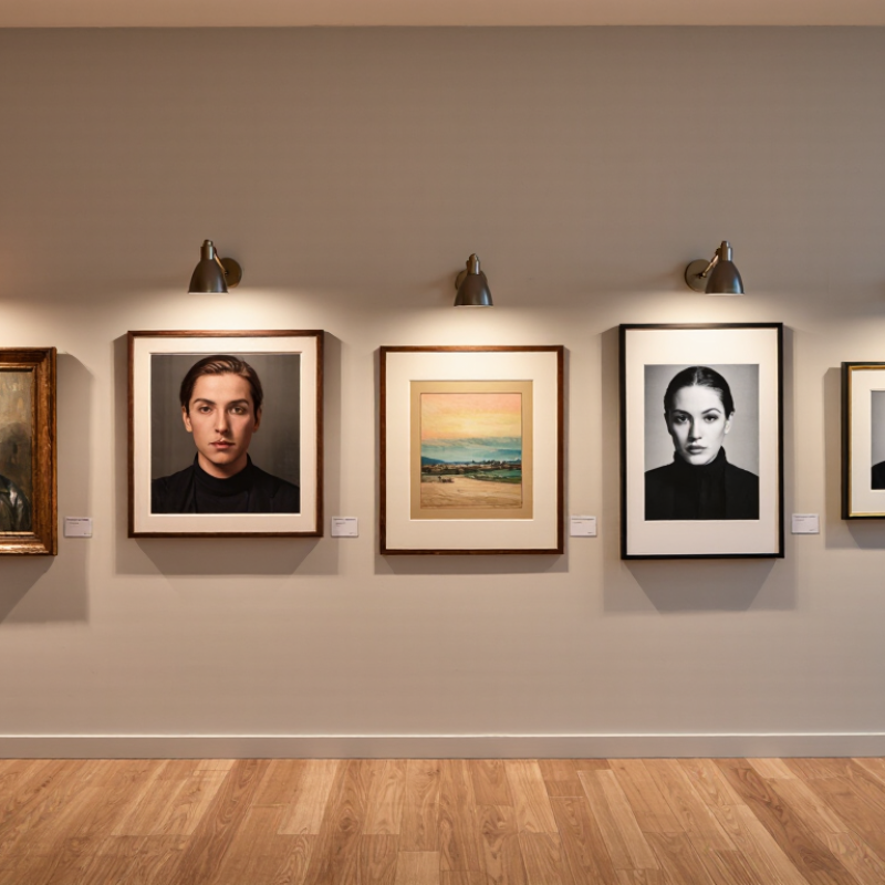
How to Choose the Best Picture and Art Lighting?

Define the Purpose and Setting of Your Picture or Art Lighting

How to Choose the Best Picture and Art Lighting?

Define the purpose before choosing a fixture. Is the artwork meant for close study, daily enjoyment, or a dramatic room accent? Each goal needs a different lighting approach. A reading area benefits from even illumination and controlled glare. A hallway may need softer light that guides attention without dominating the space.

The setting matters just as much. Measure the wall, viewing distance, ceiling height, and nearby windows. Dark walls absorb light, while pale walls reflect it and may increase glare. Choose a high color-rendering light source so skin tones, pigments, and subtle shadows appear more faithfully.

Warm light can create intimacy, but cooler light may suit modern artwork. Keep heat and ultraviolet exposure low, especially for fragile paper, textiles, and historic pieces. Conservation guidance should influence the final decision.

Tips:

Stand where visitors usually view the piece. Look for reflections on the glass. Adjust the beam until the center and edges appear balanced. Dimmers help when daylight changes. Track lights offer flexibility, while adjustable picture lights provide a cleaner visual line.

I once focused a lamp too tightly, and the center looked brilliant while the corners disappeared. It seemed effective at first. It was not. Test the arrangement at night and during daylight, then photograph the result from normal eye level. Even experienced installers sometimes miss a distracting reflection. Allow time for a second look.

Assess Artwork Materials, Colors, Size, and Display Conditions

Choosing picture lighting begins with the artwork, not the fixture. Oil paint, watercolor, paper, and dyed textiles react differently to light. The CIE 157:2004 report places highly light-sensitive materials near 50 lux, while more stable materials may tolerate about 200 lux. These are limits, not targets. Lower exposure is often safer.

Color quality matters too. A warm lamp can soften a portrait, but it may distort cool whites and blue pigments. The Illuminating Engineering Society’s TM-30 method evaluates light using 99 color samples, rather than relying only on a basic color-rendering score. Look for balanced color fidelity and moderate saturation. Test the light beside the artwork. A specification sheet cannot reveal every visual problem.

Size and display conditions change the decision. Large works may need wide, overlapping beams to prevent bright centers and dark edges. Small frames often need narrower beams. Keep light away from glazing when heat or reflections become visible. Control daylight, viewing distance, wall color, and glare together. The International Commission on Illumination also stresses ultraviolet control for sensitive collections. A practical mistake is aiming for dramatic brightness. It can make texture attractive today, but accelerate fading over time. I would recheck the room at morning, afternoon, and evening. Lighting plans often look perfect once, then fail during real viewing.

How to Choose the Best Picture and Art Lighting? - Assess Artwork Materials, Colors, Size, and Display Conditions

Artwork Factor Typical Artwork Type Recommended Illuminance Color Temperature Color Rendering Beam and Fixture Guidance Display and Protection Notes
Highly Light-Sensitive Materials Watercolor, works on paper, dyed textiles, photographs, manuscripts, and pastel drawings 2700–3000 K for a warm, gentle appearance CRI 90 or higher; select a source with low ultraviolet and infrared output Use a narrow or medium beam, carefully aimed to avoid spill onto surrounding surfaces Limit exposure duration, avoid direct sunlight, and use UV-filtering glazing where appropriate. Follow conservation requirements for valuable works.
Moderately Sensitive Materials Oil paintings, acrylic paintings, tempera, mixed-media works, and varnished surfaces 3000–3500 K for balanced warmth and color depth CRI 90 or higher, with strong red rendering for natural-looking warm pigments Use a medium beam to provide even coverage without creating bright hotspots Check the surface from several viewing angles for glare. Keep fixtures away from areas with excessive heat or vibration.
Low-Sensitivity Materials Stone, ceramic, glass, metal sculpture, and many unfinished wood objects 3000–4000 K depending on the desired atmosphere CRI 80 minimum; CRI 90 or higher for accurate color-critical displays Use spot, adjustable, or cross-lighting to reveal texture and three-dimensional form Control reflections on polished or transparent surfaces. Avoid aiming light directly into the viewer’s line of sight.
Dark or Saturated Artwork Deep blue, red, green, black, or heavily pigmented paintings 3000–3500 K usually preserves depth without making colors appear dull CRI 95 is preferred for demanding color evaluation; prioritize accurate red rendering Use a controlled medium beam and avoid excessive brightness that can flatten dark tones Compare the artwork under the selected light and under neutral ambient light before final installation.
Light-Colored or Neutral Artwork White ceramics, pale paintings, monochrome works, and light-colored prints 3000–4000 K; cooler light may emphasize a crisp contemporary setting CRI 90 or higher to distinguish subtle whites, grays, and low-contrast details Use a wide or medium beam for uniformity; add wall-wash lighting for large flat surfaces Prevent overexposure and check that the background wall does not visually overpower the artwork.
Small Artwork Small prints, miniatures, intimate paintings, and objects under approximately 60 cm wide 2700–3500 K according to the room’s existing lighting CRI 90 or higher Use a narrow beam, approximately 10°–24°, with precise aiming and glare shielding Keep the light source visually discreet. A dimmer helps balance the artwork with nearby objects.
Medium Artwork Paintings or framed works approximately 60–120 cm wide 3000–3500 K for a versatile presentation CRI 90 or higher Use a medium beam, approximately 24°–40°, or two overlapping beams for even coverage Position the fixture so the light reaches the center and edges evenly without visible scalloping.
Large Artwork Large paintings, murals, wide photographs, and works over approximately 120 cm wide 3000–4000 K depending on the architectural environment CRI 90 or higher; consistent color quality across multiple fixtures Use a wide beam, linear wall wash, or several overlapping sources to minimize hot and dark zones Measure illumination at the center, corners, and edges. Keep uniformity high so the composition reads as one whole image.
Glossy, Varnished, or Glass-Covered Works Varnished oil paintings, framed photographs, glazed prints, and polished artworks 3000–3500 K is generally comfortable for reflective surfaces CRI 90 or higher Use adjustable fixtures and cross-lighting. Avoid placing the source directly opposite the viewer. The angle of incidence equals the angle of reflection. Reposition the light or artwork to keep reflected images out of the viewing zone.
Textured or Three-Dimensional Works Relief art, carved wood, sculpture, impasto paintings, and woven textiles 3000–3500 K for visible modeling and comfortable contrast CRI 90 or higher Use directional side lighting or cross-lighting to reveal texture; soften shadows when they become distracting Test the lighting from the main viewing position. Excessively low side angles may create harsh shadows or exaggerate surface flaws.
Bright Ambient Environment Artwork displayed near windows, under strong general lighting, or in open-plan interiors Match the dominant room lighting, usually 3000–4000 K CRI 90 or higher for consistent appearance Use glare-controlled, adjustable fixtures and avoid competing light sources Use blinds, shades, or UV-filtering window treatments to reduce daylight damage and reflections.
Dim or Intimate Environment Residential galleries, restaurants, corridors, and accent-display settings 2700–3000 K for a warm and intimate atmosphere CRI 90 or higher Use narrow or medium beams with dimming capability to control contrast and visual comfort Maintain enough surrounding light for safe movement and comfortable adaptation between bright and dark areas.
Energy and Control Requirements Permanent displays, rotating exhibitions, homes, offices, and hospitality interiors Use only the illuminance needed for legibility and visual impact Keep the selected color temperature consistent within the same viewing zone Choose stable color quality and low-flicker performance Prefer dimmable, adjustable fixtures with shielding and precise beam control Use timers, occupancy controls, or daylight sensors where suitable. Recheck light levels after installation and whenever the display changes.
Practical measurement note: Illuminance is measured in lux at the artwork surface. The recommended ranges are general display guidelines; fragile, historically significant, or highly valuable works should be assessed by a qualified conservator. Always prioritize glare control, low heat, low ultraviolet exposure, accurate color rendering, and consistent illumination.

Compare Light Sources, Color Temperature, and Color Accuracy

When I light paintings, I compare the light source before adjusting its brightness. LED fixtures usually run cool and offer stable output. Halogen lamps reveal warm reds well, but they produce heat and can fade sensitive materials over time. Daylight gives natural balance, yet clouds can change the viewing conditions within minutes. Fluorescent light may appear efficient, but some tubes create uneven color or visible flicker. That difference matters.

Color temperature affects the atmosphere around the artwork. A 2700K source creates a warm, intimate feeling, while 4000K appears cleaner and more neutral. Daylight near 5000K can show cool blues clearly, but it may make warm frames look dull. Color temperature alone is not enough. Check the color rendering index, especially the red rendering value, when judging portraits, wood, and painted surfaces. High CRI helps, but numbers can still hide weaknesses in specific colors.

I place the fixture about 30 degrees from the artwork to reduce glare. A matte painting may tolerate a wider angle, while glossy varnish needs careful repositioning. I also inspect the piece under its intended room lighting, not only under a showroom lamp. Once, I trusted a high CRI rating and missed a weak green response. The result looked slightly lifeless. I should have tested a printed color chart beside the artwork. Small errors remain. They are useful warnings.

How to Choose the Best Picture and Art Lighting?

Compare light sources by typical color temperature, color accuracy, and energy efficiency.

For artwork, prioritize a high CRI—ideally 90 or above—to preserve subtle colors and textures. Warm light around 2700–3000 K is commonly preferred for traditional paintings, while 3500–4000 K can provide a cleaner appearance for contemporary art and galleries. LED sources generally offer the best balance of color accuracy, efficiency, and controllable color temperature. Values shown are representative industry ranges; actual performance varies by product and design.

Choose the Right Fixture, Beam Angle, and Lighting Placement

How to Choose the Best Picture and Art Lighting?

Choose the Right Fixture, Beam Angle, and Lighting Placement

Start with the artwork, not the fitting. A slim adjustable fixture usually works well for framed pictures. It can direct light without dominating the wall. Choose a color temperature near 3000K for warm, comfortable viewing. For valuable or light-sensitive pieces, select a high color rendering index, ideally 90 or above. Colors should look honest.

Beam angle controls the visual emphasis. A narrow beam can highlight a small sculpture or detailed painting. However, it may create a harsh bright spot. A wider beam gives larger artwork smoother coverage. Measure the picture before choosing. As a practical guide, place the light about 30 to 45 degrees above the artwork. Aim across the surface, rather than straight at it. This reduces glare on glass.

Placement needs testing. Move the fixture slightly while viewing the art from normal standing height. Check nearby seating, too. Reflections often appear from unexpected angles. In one installation, I placed the light too close to the frame, and the upper edge became distracting. The diagram looked correct. The result did not. Track-mounted fixtures offer useful flexibility when wall layouts may change. Recessed fittings look cleaner, but their fixed position can limit adjustment. Leave enough distance for even illumination, and avoid light spilling onto empty walls. Each artwork may need a small correction.

Set Brightness, Reduce Glare, and Protect the Artwork Over Time

Picture lighting should reveal texture without making the glass the brightest object. Start by observing the room at different times. Daylight changes the result. I have sometimes set a display too bright, then noticed faded-looking colors and tired eyes. A dimmable fixture allows small adjustments instead of one harsh setting. Aim the beam slightly across the artwork, not straight into the viewer’s sightline. This reduces reflected glare on glass and glossy varnish.

For brightness, compare the artwork with nearby walls and furniture. It should feel clear, not theatrical. A light meter can help, but visual checks still matter.

Keep the artwork away from direct sun, radiators, and hot enclosed fixtures. Quality lighting should produce little heat and minimal ultraviolet exposure. However, “low heat” does not mean risk-free.

Older, sensitive, or valuable works deserve advice from a qualified conservator. Their materials may react differently to light.

Check the picture after dusk, when reflections often become more obvious. Clean the glass carefully, because dust can scatter light and create bright specks. Leave space around the frame for ventilation.

Over time, rotate displays only when appropriate; moving a fragile piece can cause damage. My own weak point is relying on one viewing angle. A comfortable chair may reveal glare that disappears while standing. Recheck the setting every few months, especially after changing curtains, bulbs, or furniture.

FAQS

What should I decide before choosing picture lighting?

Decide whether the artwork needs close study, daily enjoyment, or dramatic emphasis. A hallway may need gentle light. A reading area needs even illumination and controlled glare. The purpose changes the fixture choice.

How should the room affect my lighting decision?

Measure the wall, viewing distance, ceiling height, and nearby windows. Dark walls absorb light, while pale walls can increase glare. Check the artwork from normal standing height. The room matters more than expected.

What light level is safe for sensitive artwork?

Watercolors, paper, and dyed textiles need especially cautious lighting. Highly sensitive materials may suit approximately 50 lux. More stable materials may tolerate about 200 lux. These are limits, not targets. Lower exposure is often safer.

Which color temperature and color quality work well?

Around 3000K usually creates warm, comfortable viewing. A high color-rendering value, ideally 90 or above, helps preserve visual accuracy. Warm light may soften portraits but distort blue or cool-white areas. Test the lamp beside the artwork.

How do I choose the correct beam angle?

Narrow beams suit small artworks and detailed objects. They can create harsh bright spots. Wider beams cover large pieces more evenly. Overlapping beams may prevent bright centers and dark corners.

Where should the light be placed?

Position the fixture about 30 to 45 degrees above the artwork. Aim across the surface, rather than straight at it. This can reduce reflections on glass. Move it slightly while checking the picture.

How can I reduce glare and unwanted reflections?

Stand where visitors usually sit or walk. Look for bright reflections on the glazing. Check nearby seating from several angles. One small adjustment may solve the problem.

Are adjustable fixtures better than fixed lighting?

Adjustable fixtures help when artwork size or wall arrangements change. Track-mounted options offer flexible positioning. Recessed fittings appear cleaner but may limit adjustment. Clean-looking is not always practical.

How should I test the final lighting arrangement?

Test it during daylight and at night. Review the room in the morning, afternoon, and evening. Photograph the artwork from normal eye level. My own tightly focused lamp looked brilliant at first. It was not. The corners disappeared.

Conclusion

Choosing the right Picture and art lighting begins with understanding the artwork, its purpose, and the environment in which it will be displayed. Consider whether the lighting is intended for a home, gallery, office, or exhibition, then evaluate the artwork’s materials, colors, dimensions, frame, and viewing distance. Delicate surfaces, dark tones, and highly reflective finishes may require different lighting approaches to reveal detail without causing visual distractions.

Next, compare light sources by color temperature, consistency, and color accuracy so the artwork appears natural and balanced. Select a fixture with a suitable beam angle and position it to provide even coverage while avoiding harsh shadows and reflections. Brightness should be adjustable to match the room and protect sensitive materials from excessive exposure. By controlling glare, heat, and long-term light intensity, effective Picture and art lighting can enhance visual impact while helping preserve the artwork’s appearance over time.

Julian

Julian

Julian is a highly experienced marketing professional with a deep understanding of the company’s products, customer needs, and industry trends. Through clear analysis and practical insight, he helps readers discover how thoughtful solutions can improve efficiency, support informed decision-making,......